

Client Project + Project Overview:
SARC is a tech management company offering innovative IT solutions and support for businesses. The goal was to design a sleek, professional logo that captured the essence of modern technology, structure, and trust.
SARC is a tech management company offering innovative IT solutions and support for businesses. The goal was to design a sleek, professional logo that captured the essence of modern technology, structure, and trust.
My Role:
Brand designer — commissioned to create the logo and foundational visual identity for SARC.
Brand designer — commissioned to create the logo and foundational visual identity for SARC.
The Challenge:
Design a minimal, future-ready logo that feels clean and intelligent — avoiding generic tech clichés while still communicating innovation and professionalism.
Design a minimal, future-ready logo that feels clean and intelligent — avoiding generic tech clichés while still communicating innovation and professionalism.
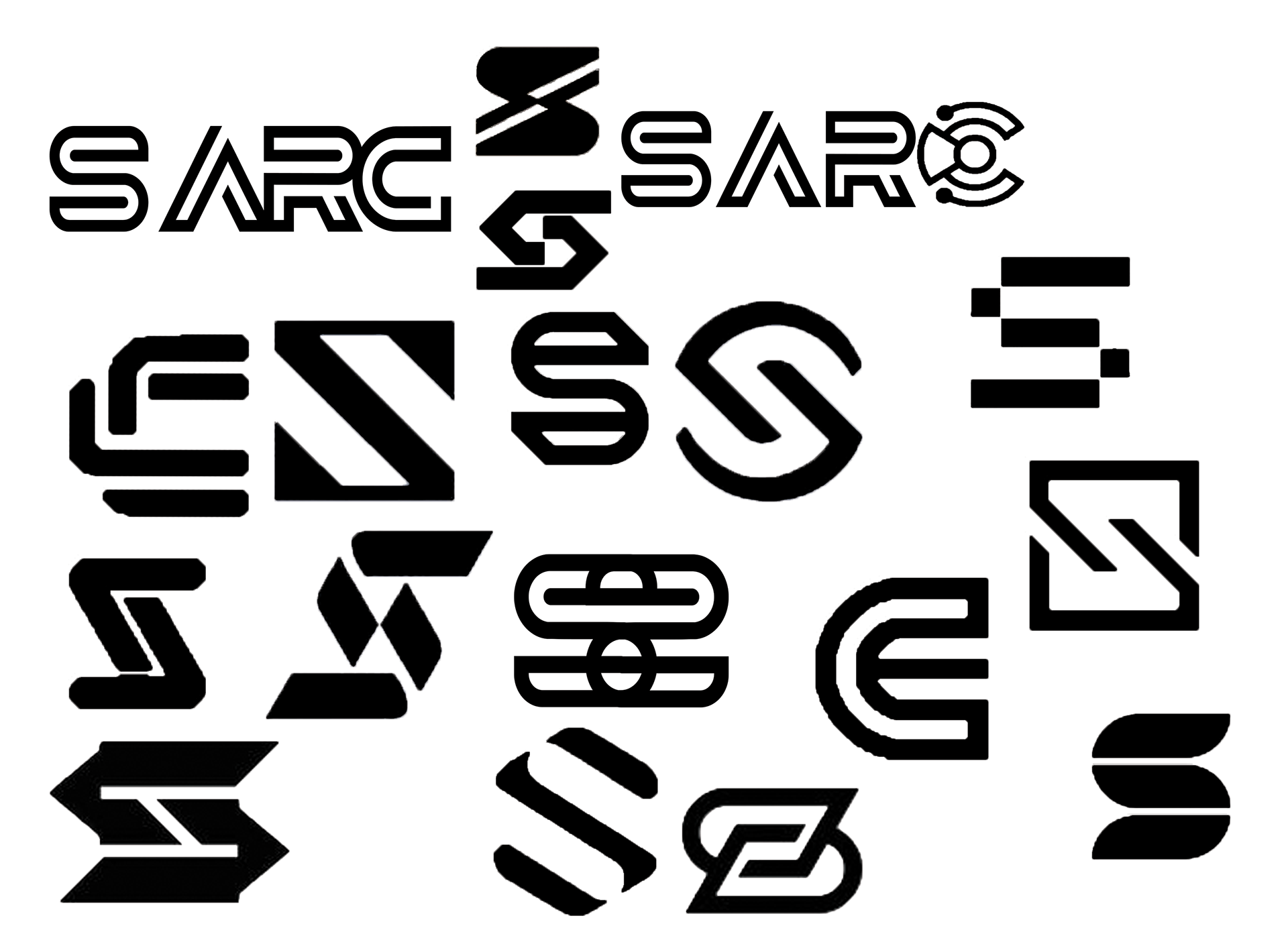
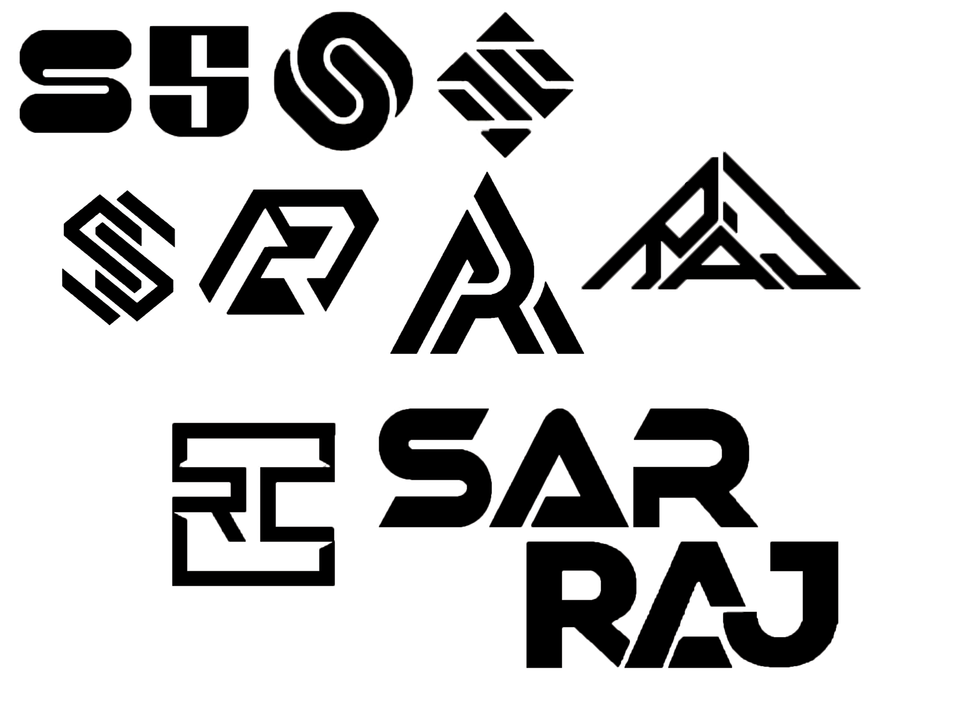
The Process:
I explored a variety of typographic directions before selecting Garde, a geometric sans-serif that communicates modernity, balance, and sharpness. I focused on refining the spacing and visual rhythm of the letterforms to give it a strong, intentional feel. Color exploration stayed within cool, neutral tones to reflect reliability and tech-forward clarity.
I explored a variety of typographic directions before selecting Garde, a geometric sans-serif that communicates modernity, balance, and sharpness. I focused on refining the spacing and visual rhythm of the letterforms to give it a strong, intentional feel. Color exploration stayed within cool, neutral tones to reflect reliability and tech-forward clarity.
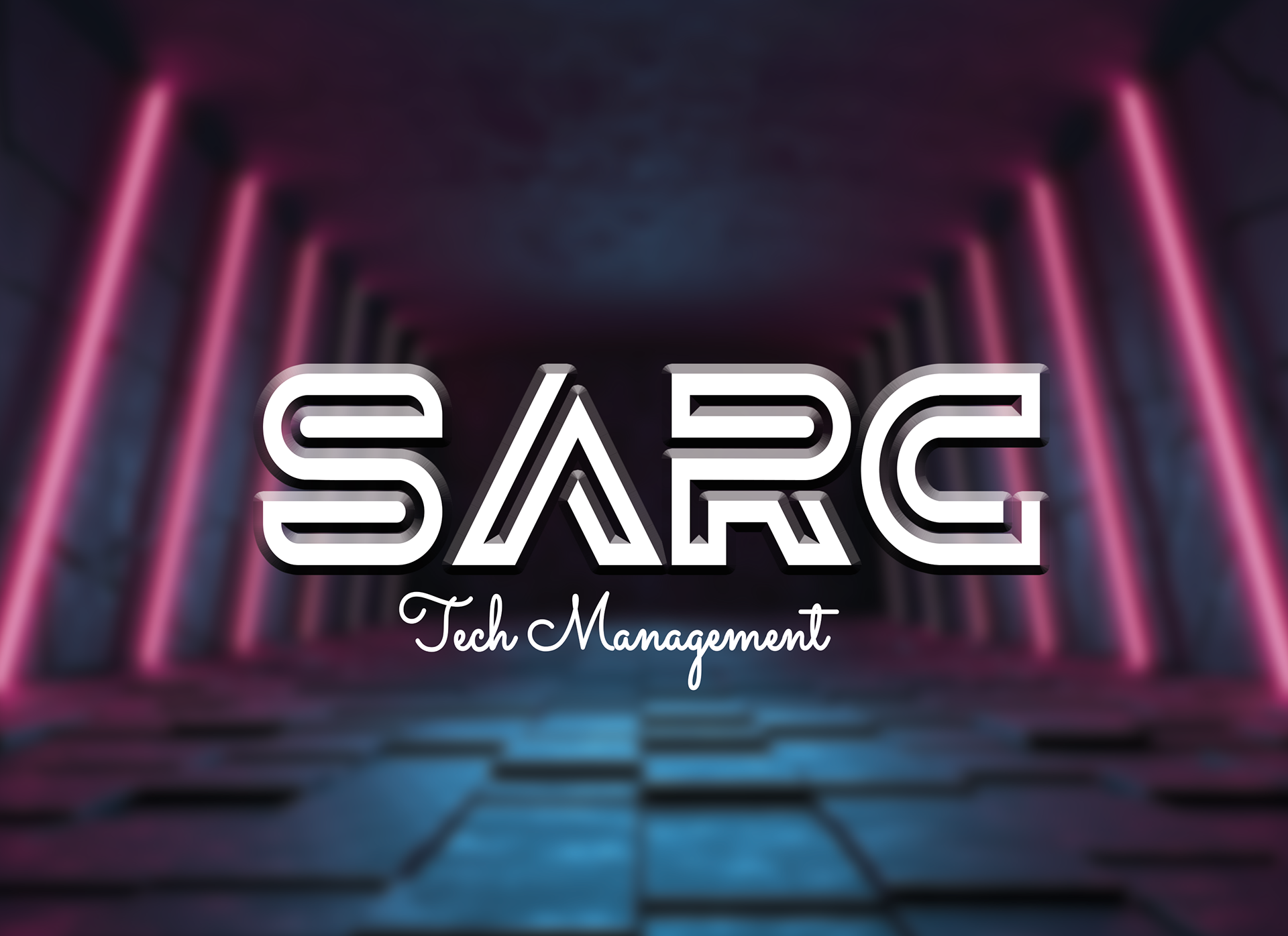
Final Logo:
Typeface: Garde – selected for its modern geometry and sharp legibility
Styling: Clean wordmark with precise spacing and proportional integrity
Usage: Designed for digital interfaces, decks, and business materials
Reflection:
This project allowed me to dive deeper into typographic branding and work 1:1 with a client to translate their values into a visual system. The final logo strikes a balance between simplicity and smart design — and gave me great experience delivering a polished product in a professional context.
This project allowed me to dive deeper into typographic branding and work 1:1 with a client to translate their values into a visual system. The final logo strikes a balance between simplicity and smart design — and gave me great experience delivering a polished product in a professional context.