

Project Overview:
Mumbai Respawn is a conceptual esports brand that reimagines the spirit of competition through a futuristic lens rooted in the energy of Mumbai. The goal was to build a visual identity that fused tradition and technology — grounded in culture, but made for the next generation of players.
Mumbai Respawn is a conceptual esports brand that reimagines the spirit of competition through a futuristic lens rooted in the energy of Mumbai. The goal was to build a visual identity that fused tradition and technology — grounded in culture, but made for the next generation of players.
My Role:
Sole designer and brand strategist. I led everything from visual direction and logo design to mock-ups and presentation assets.
Sole designer and brand strategist. I led everything from visual direction and logo design to mock-ups and presentation assets.
The Challenge:
Design an original esports brand that feels culturally grounded, futuristic, and dynamic — with a unique identity that could live across apparel, web, and in-game environments.
Design an original esports brand that feels culturally grounded, futuristic, and dynamic — with a unique identity that could live across apparel, web, and in-game environments.
The Process:
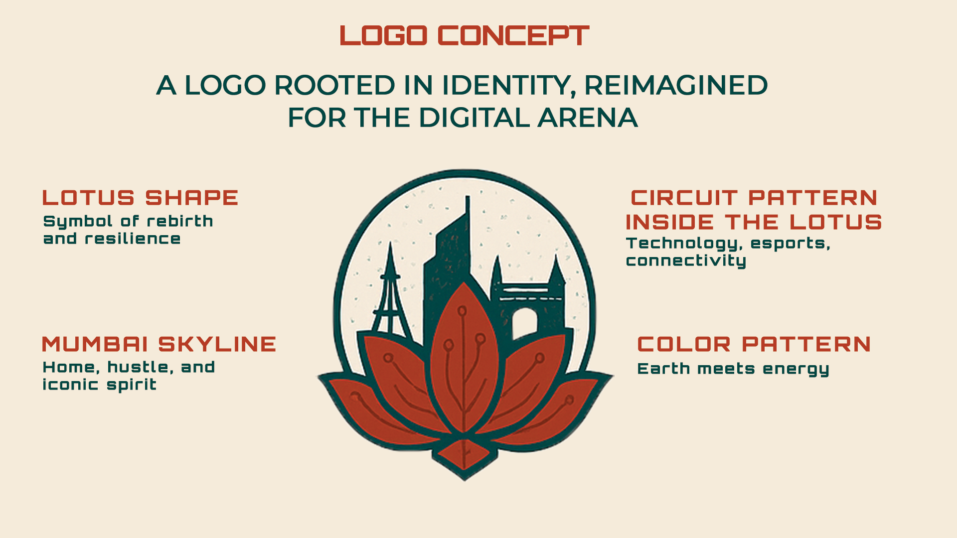
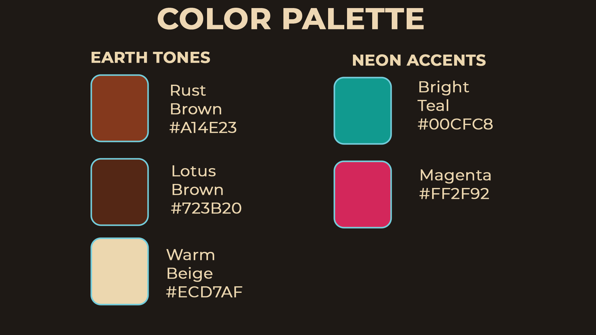
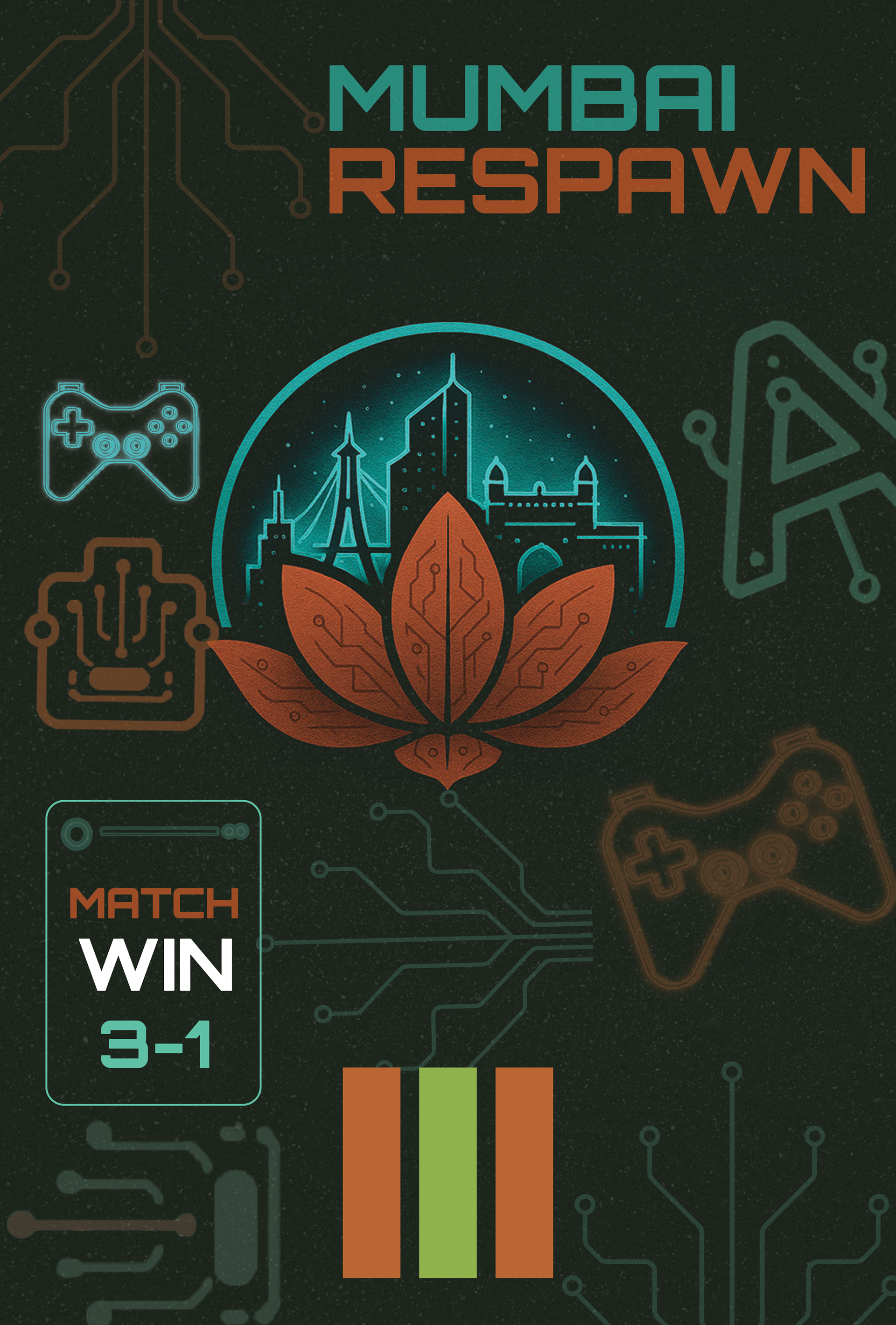
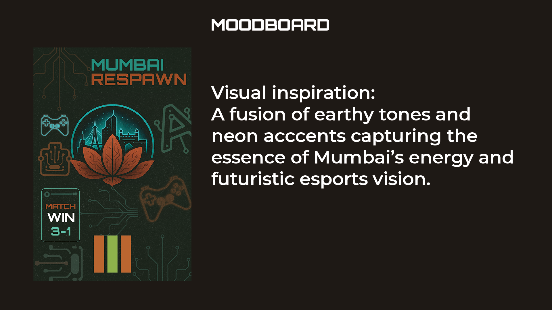
I started by researching Mumbai’s architecture and symbolism, eventually landing on a stylized lotus (India’s national flower) embedded with circuit-like elements to reflect digital life. The typography uses Orbitron for its tech-forward energy, while color choices balanced earth tones with neon pops — like teal and electric orange — to reflect vibrancy and energy.
I started by researching Mumbai’s architecture and symbolism, eventually landing on a stylized lotus (India’s national flower) embedded with circuit-like elements to reflect digital life. The typography uses Orbitron for its tech-forward energy, while color choices balanced earth tones with neon pops — like teal and electric orange — to reflect vibrancy and energy.
Final Identity:
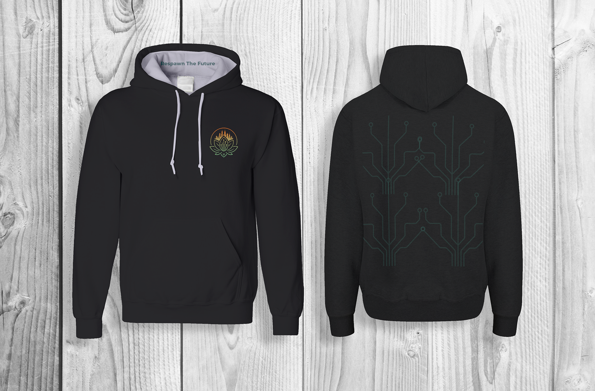
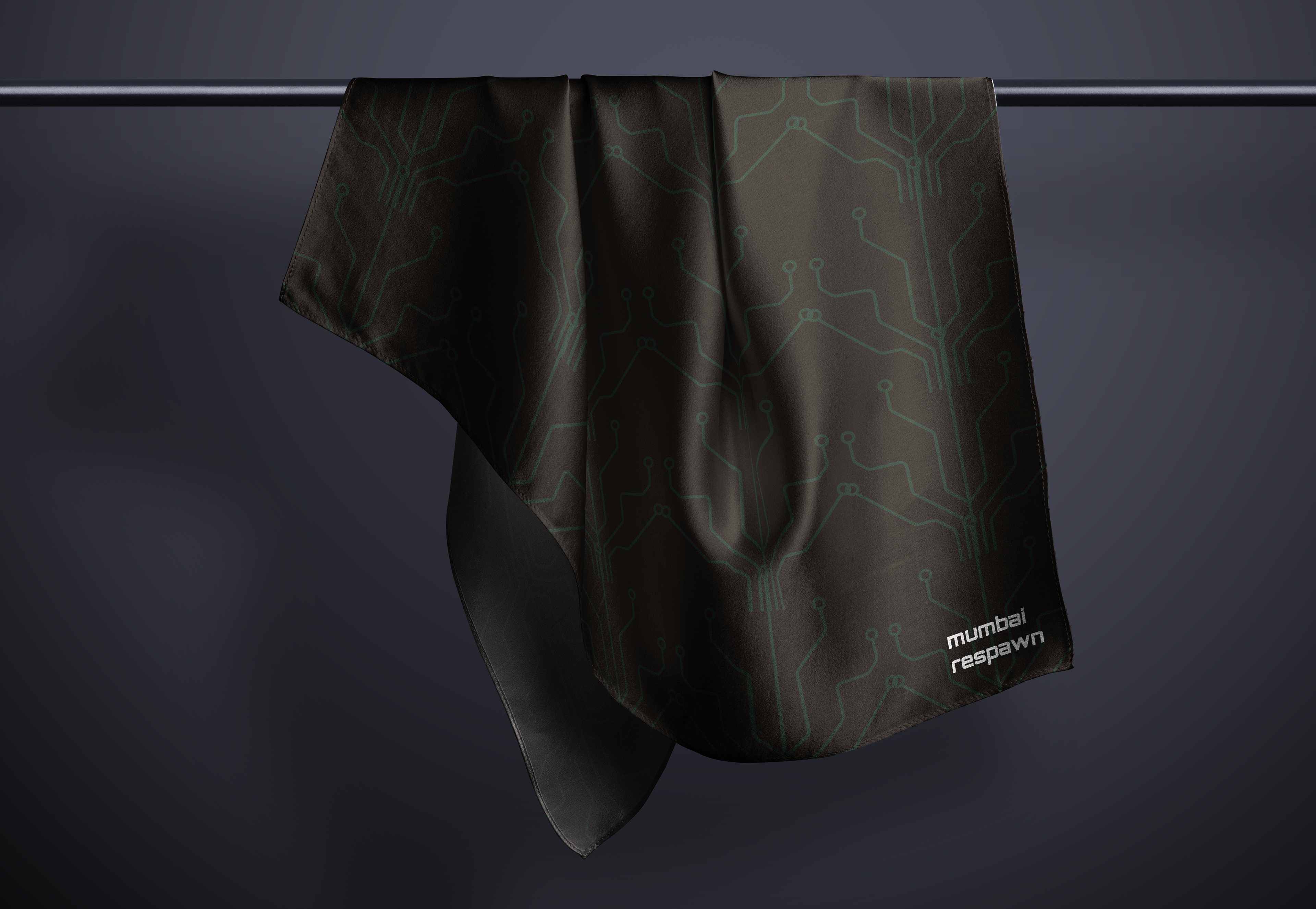
Primary Logo: An abstract lotus with embedded circuits and the city of Mumbai layered above.
Typography: Orbitron + supporting text styles for clarity and edge.
Color Palette: Warm neutrals with bright accent colors to reflect the contrast between grounded tradition and digital movement.
Mockups: Hoodie, scarf, landing page, and esports gear — designed to show brand flexibility and merchandise potential.
Reflection:
This project gave me the freedom to combine brand storytelling with expressive visual design. It pushed me to explore logo abstraction and showcase how identity can scale across digital and physical spaces. I'd love to continue building brand ecosystems like this — especially in the gaming and tech space.
This project gave me the freedom to combine brand storytelling with expressive visual design. It pushed me to explore logo abstraction and showcase how identity can scale across digital and physical spaces. I'd love to continue building brand ecosystems like this — especially in the gaming and tech space.


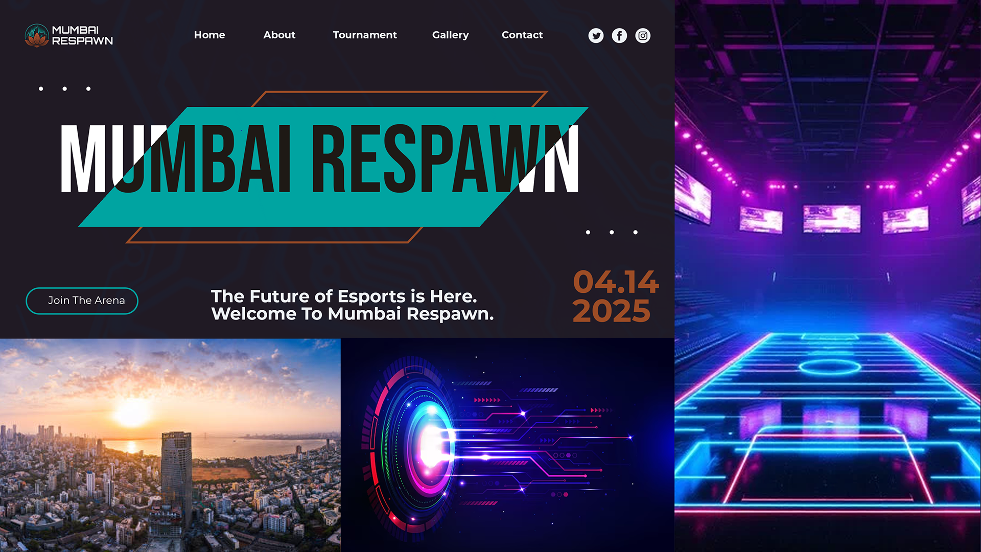
Mumbai Respawn's landing page