


Client Project (Former Professor)
Project Overview:
Environmental Design & Research (EDR) sought a logo redesign that would reflect their commitment to environmental sustainability and research. The aim was to modernize their branding while emphasizing their connection to nature and eco-conscious practices.
Project Overview:
Environmental Design & Research (EDR) sought a logo redesign that would reflect their commitment to environmental sustainability and research. The aim was to modernize their branding while emphasizing their connection to nature and eco-conscious practices.
My Role:
Logo redesign, visual identity, and landing page design — I was tasked with creating a modern, nature-inspired logo and a cohesive digital identity for the company.
Logo redesign, visual identity, and landing page design — I was tasked with creating a modern, nature-inspired logo and a cohesive digital identity for the company.
The Challenge:
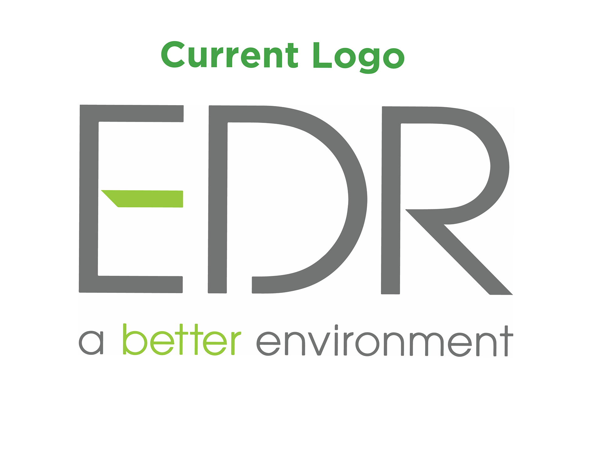
Redesign an established brand while maintaining its core values, focusing on the environment and sustainability. The challenge was to incorporate nature-inspired elements while ensuring the design looked professional and modern.
Redesign an established brand while maintaining its core values, focusing on the environment and sustainability. The challenge was to incorporate nature-inspired elements while ensuring the design looked professional and modern.
The Process:
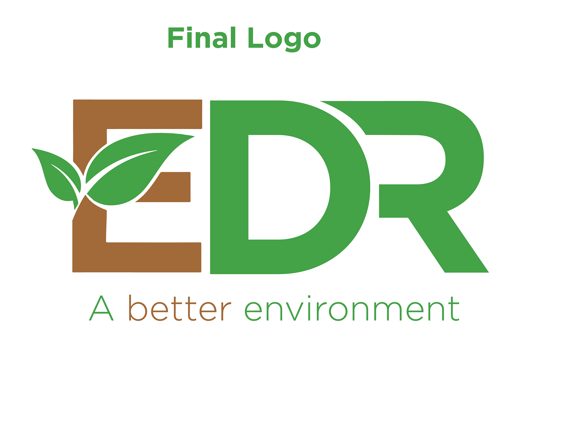
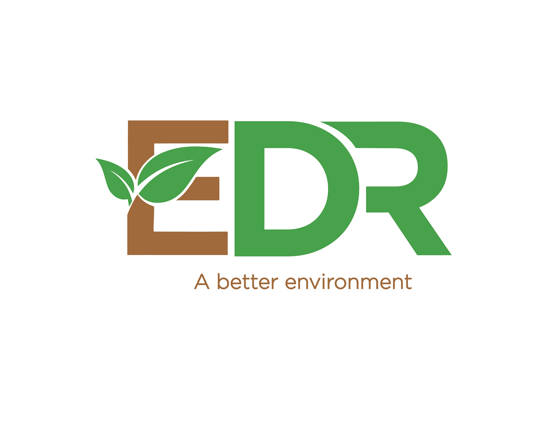
I began by exploring nature-based elements and colors, settling on a color palette of yellow, brown, and green to represent the earth, growth, and vitality. The letter "E" in the logo was reworked to incorporate tree leaves between the E to give the impression of a tree, symbolizing growth and environmental focus.
I began by exploring nature-based elements and colors, settling on a color palette of yellow, brown, and green to represent the earth, growth, and vitality. The letter "E" in the logo was reworked to incorporate tree leaves between the E to give the impression of a tree, symbolizing growth and environmental focus.
In addition to the logo, I designed a landing page to complement the new identity, showcasing a clean, minimal layout that aligned with the brand’s eco-conscious values.
Final Design:
Logo: A reimagined "E" with tree leaves, using brown as the primary color to symbolize the earth, complemented by green and yellow accents for a natural, eco-friendly feel.
Color Palette: Earth tones — yellow, brown, and green — reflecting nature, growth, and sustainability.
Landing Page: A simple, eco-friendly design that matches the modern logo and highlights EDR’s commitment to the environment.
Reflection:
This project was an opportunity to combine my love for minimal design with my passion for sustainability. The updated logo and landing page reflect the company’s environmental focus while bringing their branding into the modern era.
This project was an opportunity to combine my love for minimal design with my passion for sustainability. The updated logo and landing page reflect the company’s environmental focus while bringing their branding into the modern era.
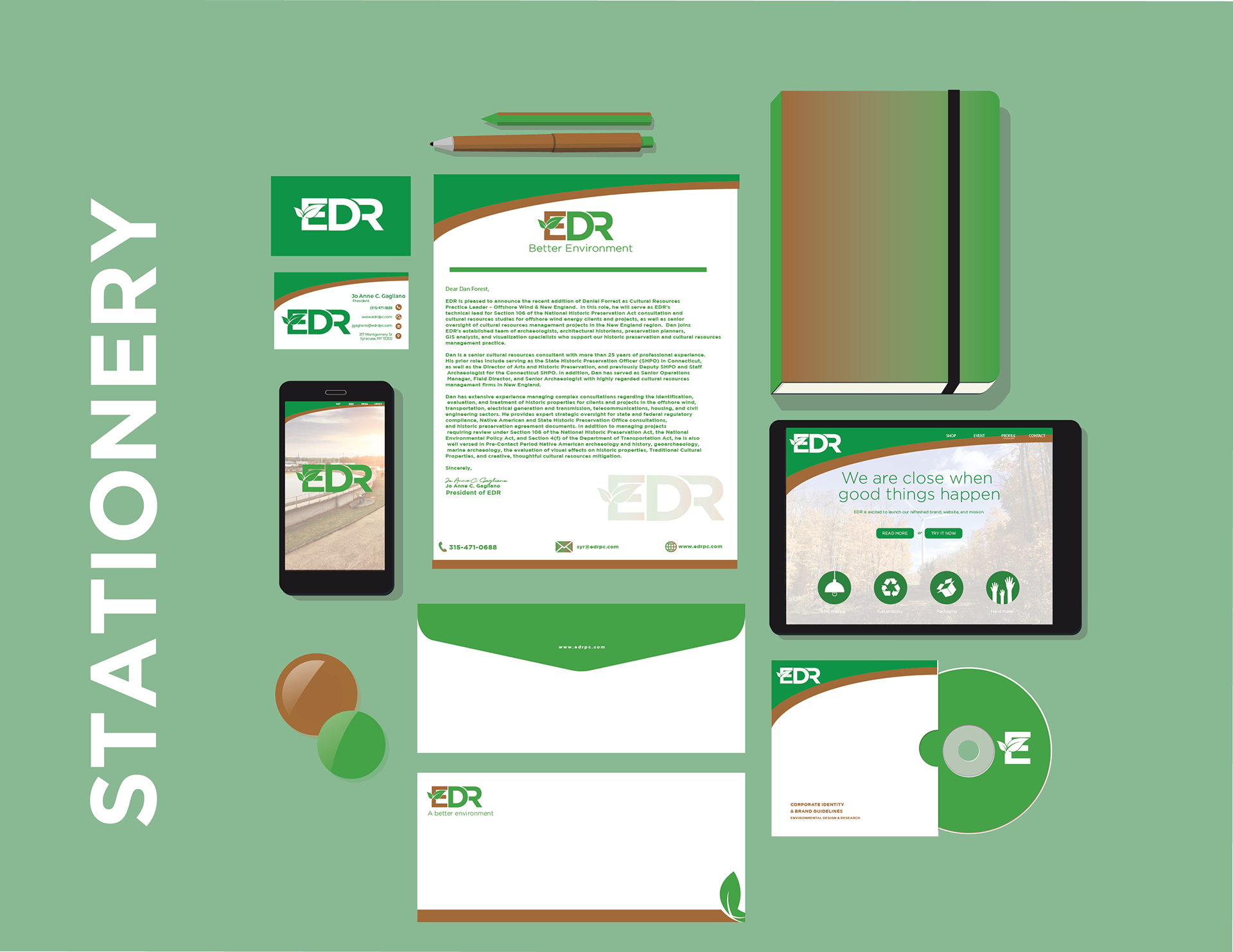
STATIONERY
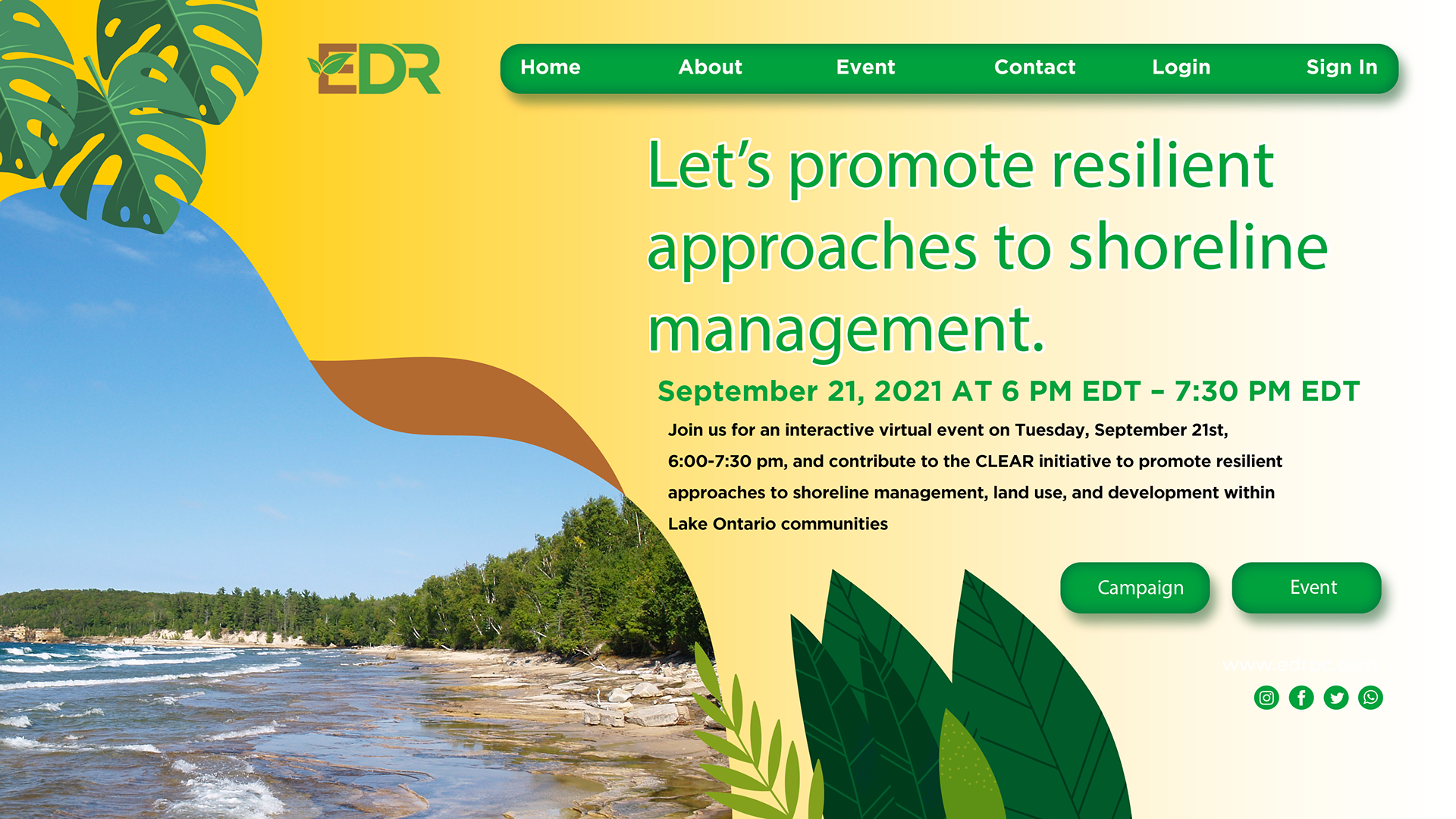
Landing Page
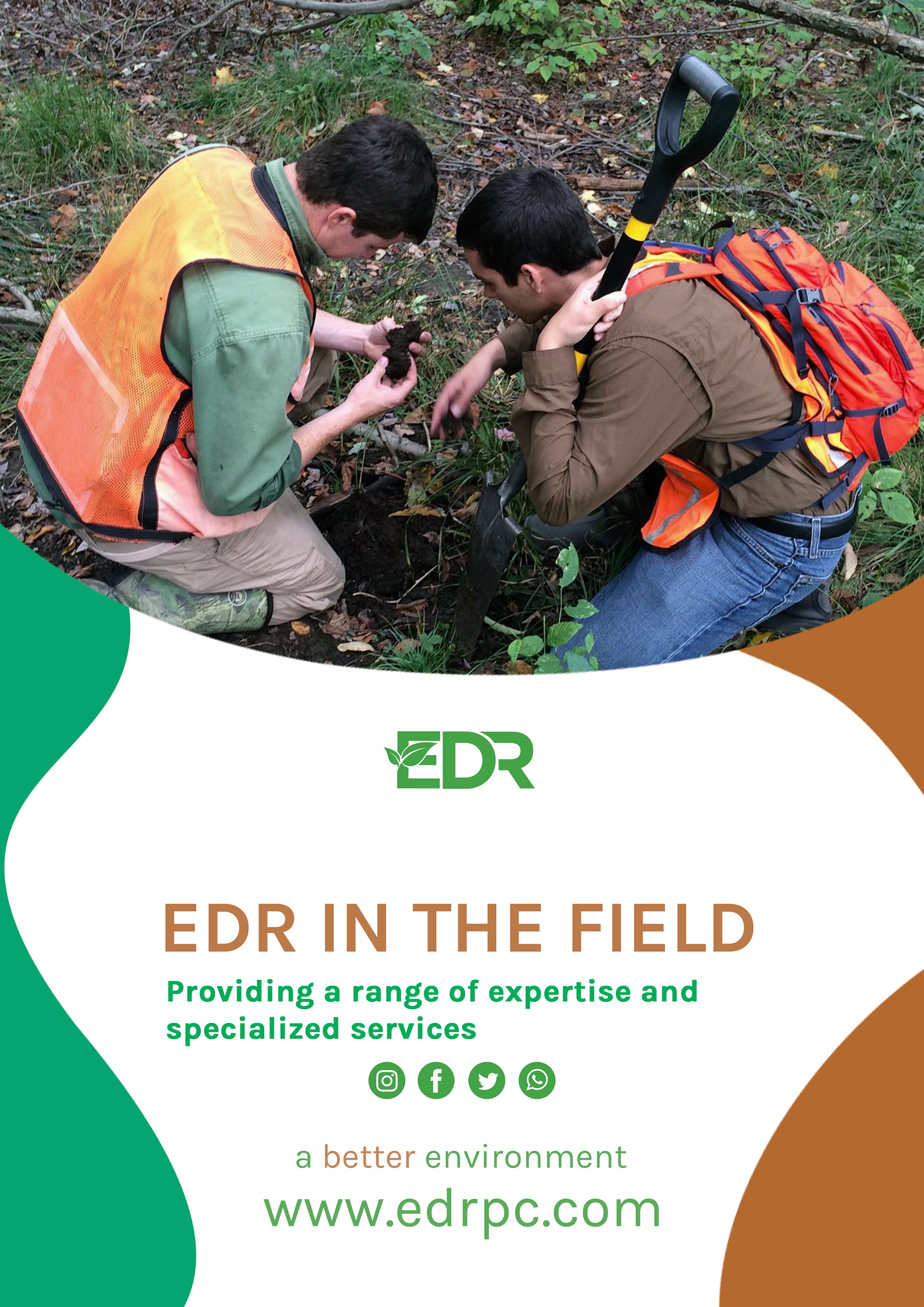
Poster Ad
Thanks for viewing!