

Unreleased Client Work + Project Overview:
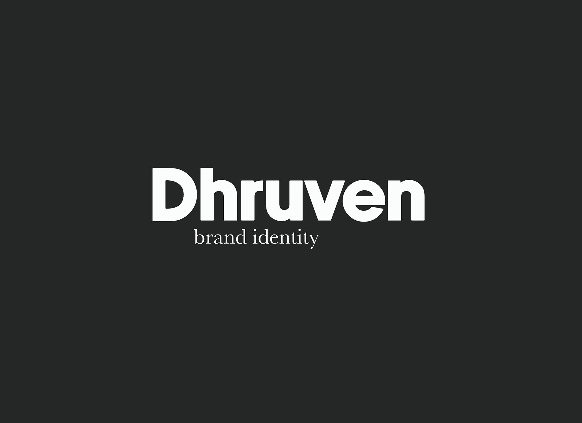
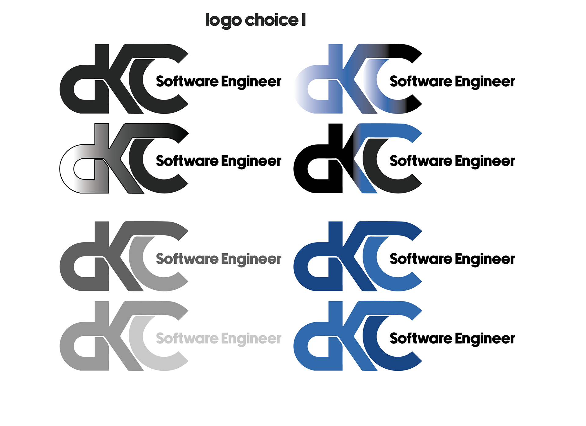
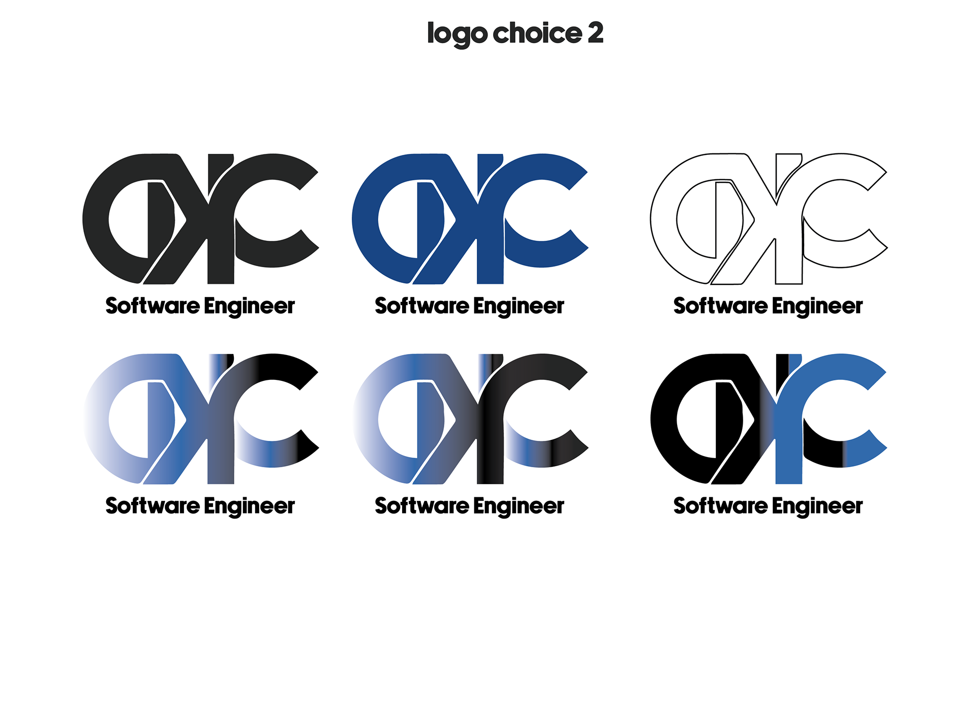
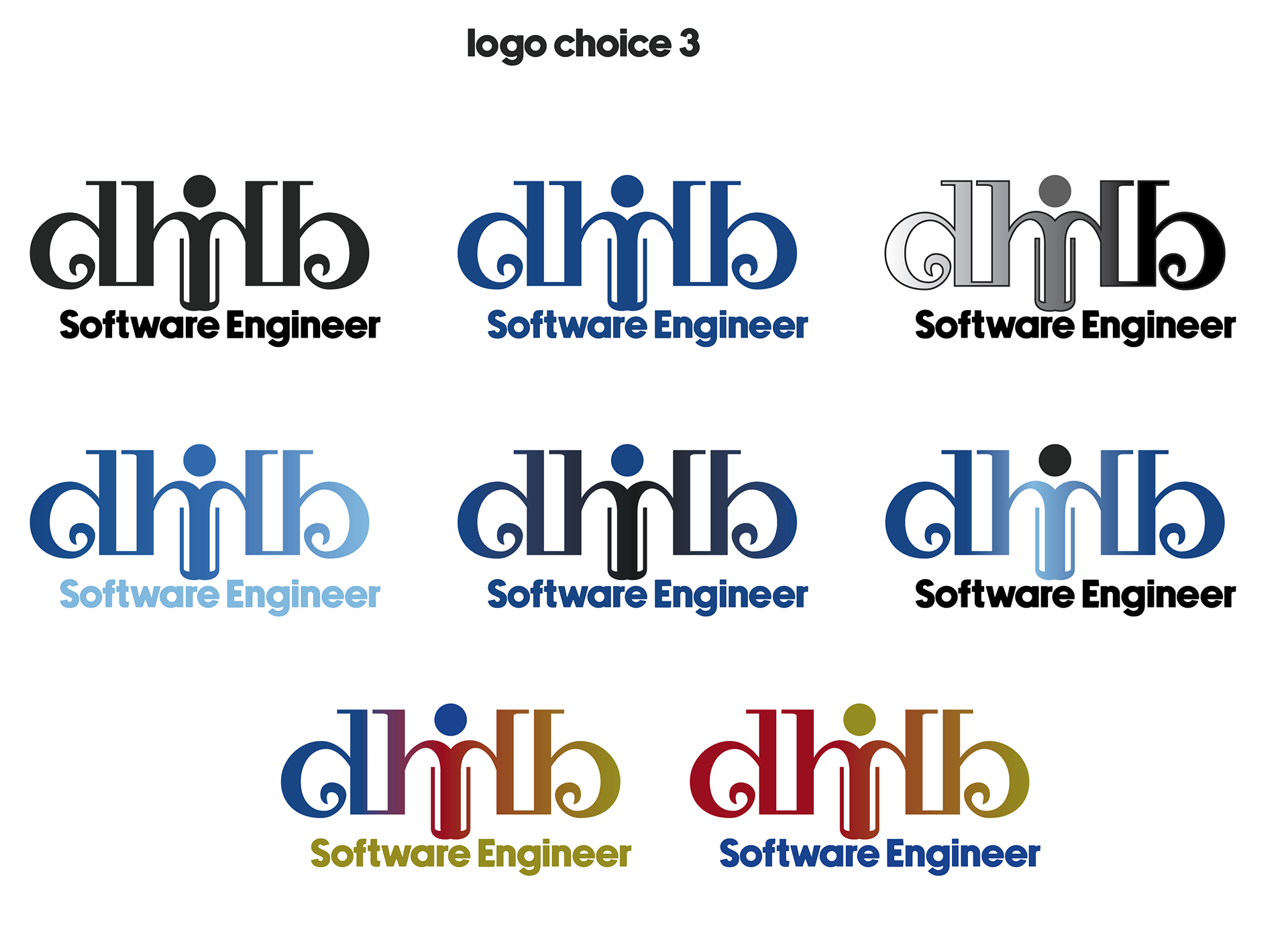
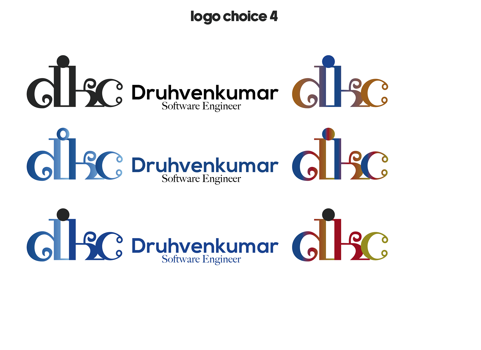
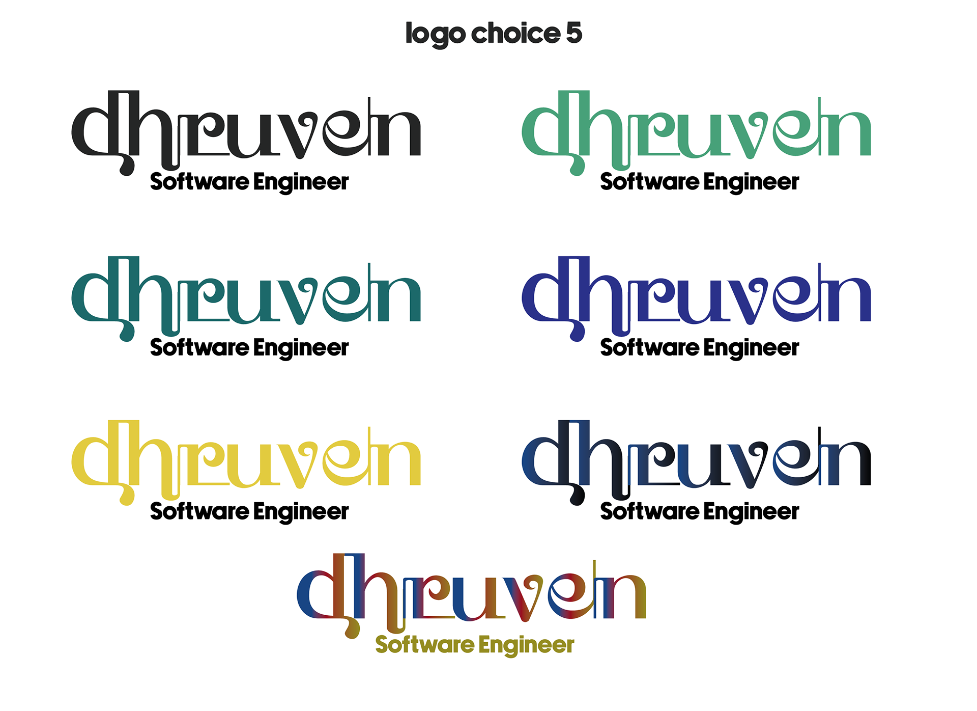
This logo was designed for Dhruven, a tech-forward individual. The visual identity blends minimalism with playful energy, using bold color and shape to create a memorable personal mark.
My Role:
Concept development anad logo design — I led the creative direction, focusing on form, balance, and symbolism.
Concept development anad logo design — I led the creative direction, focusing on form, balance, and symbolism.
The Concept:
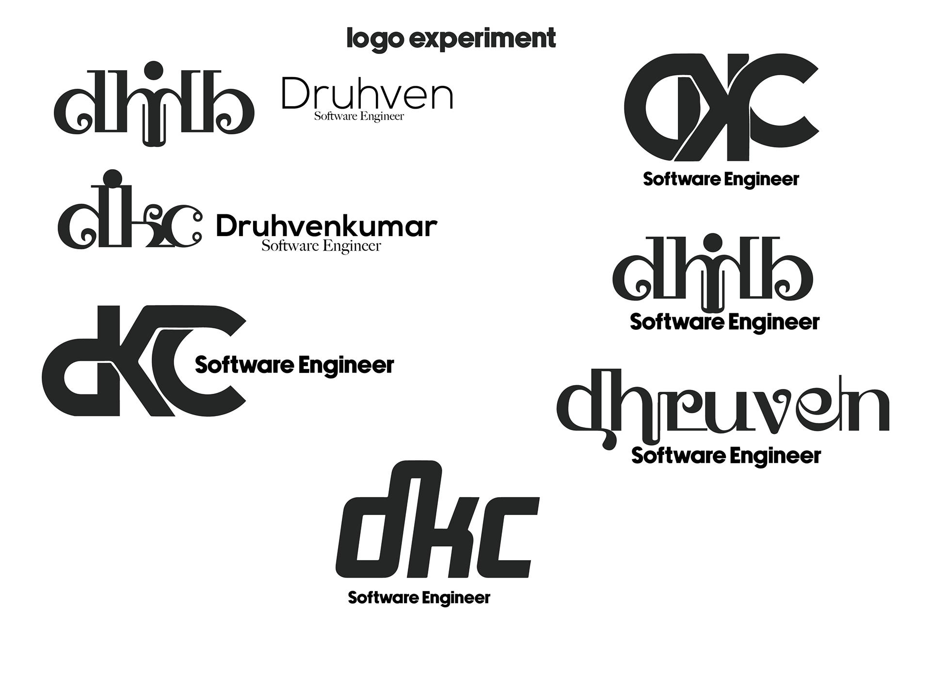
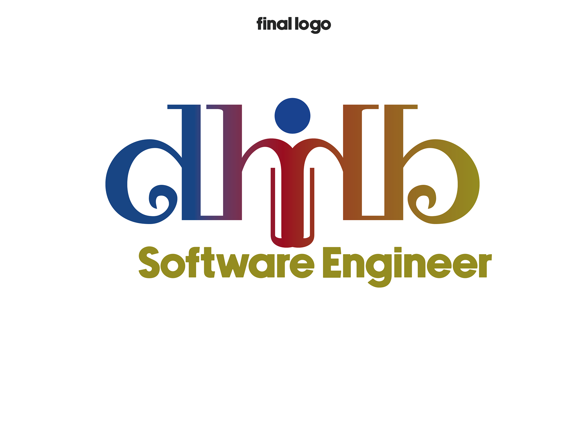
The mark features two mirrored letter D’s, facing outward to suggest connection, reflection, or communication. A circular shape was added in the center to subtly resemble a person working at a computer — giving it a human and tech-inspired feel.
The mark features two mirrored letter D’s, facing outward to suggest connection, reflection, or communication. A circular shape was added in the center to subtly resemble a person working at a computer — giving it a human and tech-inspired feel.
Color Palette:
Red, blue, and yellow — chosen for their energetic, primary quality, creating a bold and optimistic tone. These colors also lend a slightly retro-modern tech feel.
Red, blue, and yellow — chosen for their energetic, primary quality, creating a bold and optimistic tone. These colors also lend a slightly retro-modern tech feel.
Final Design:
Mirrored D monogram with symbolic central circle
Primary color palette for personality and contrast
Designed for potential use across personal branding, digital profiles, and icon systems
Reflection:
Though the project wasn’t finalized, it gave me a chance to push symbolic design and color play while still keeping things minimal. It remains one of my favorite logo explorations — and a great reminder that not every project has to launch to be worth showcasing.
Though the project wasn’t finalized, it gave me a chance to push symbolic design and color play while still keeping things minimal. It remains one of my favorite logo explorations — and a great reminder that not every project has to launch to be worth showcasing.